Personal Project
2020
Shopee Design Challenge
Submission for open design challenge with Shopee

Overview
Our team's submission for the Shopee Design Challenge 2020 explored how Shopee could expand beyond traditional e-commerce by introducing local service providers into its ecosystem.
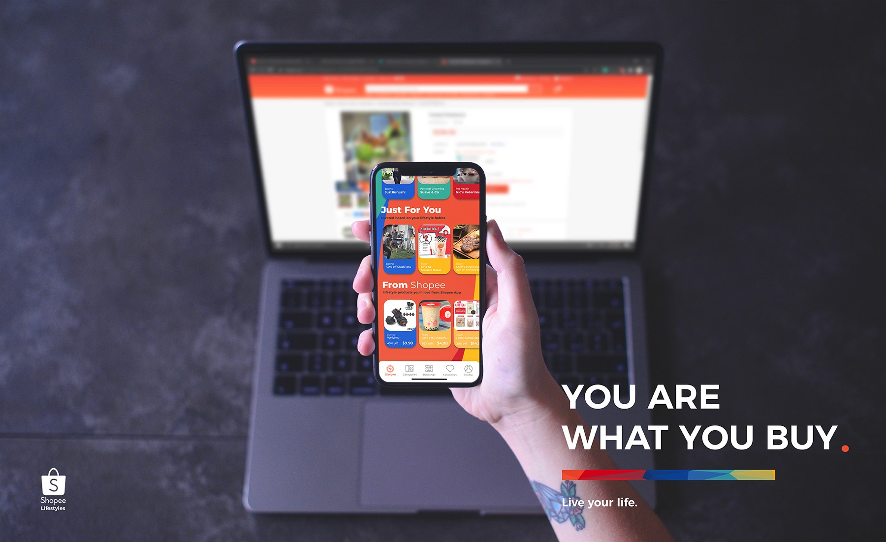
Working as a team of two over three weeks, we proposed Shopee Lifestyle, a concept that enables users to discover, compare, and book services such as barbers, cleaning services, catering, and home maintenance directly within the Shopee app.
The project focused on creating a seamless experience that remained familiar to existing Shopee users while introducing an entirely new category of products and services.
My Role
UI Designer · Product Manager
Responsibilities included:
Conducting user research and opportunity discovery
Defining the product concept and feature scope
Designing user flows for buyers and service providers
Creating wireframes, UI mockups, and interactive Figma prototypes
Presenting the concept and design rationale
The Opportunity
Could Shopee become a one-stop platform not only for products, but also for services?

During our research, we noticed that many small service providers relied heavily on word-of-mouth, social media, or their own advertising to attract customers.
Meanwhile, Shopee had already established itself as a trusted marketplace with an existing payment ecosystem and large user base.
Design Goals
The solution was built around four principles.
Discoverability
Allow users to browse nearby services as naturally as they browse products.
Familiarity
Integrate new functionality without changing the interaction patterns users already understood.
Trust
Leverage Shopee's existing ecosystem, ratings, reviews, and payment flow to reduce friction.
Scalability
Create a framework capable of supporting many different categories of service providers.
Some of the key considerations also included:
Maintaining visual consistency with Shopee's existing interface
Introducing service listings without overwhelming existing product browsing
Prioritising important actions such as booking and contact
Building reusable layouts that could scale across different service categories
The Solution
User Journeys
Buyer Journey Link
Seller Journey Link
Separate user journeys were designed for both sides of the marketplace.
Customer Journey
Discovery → Comparison → Booking → Confirmation
Seller Journey
Registration → Service Listing → Booking Management → Customer Fulfilment
Designing both journeys helped ensure that business requirements and user needs were considered together rather than in isolation.
Shopee Lifestyle introduced a dedicated services section that allowed users to:
Browse local service providers
Compare listings
Save favourites
View recommendations
Make bookings directly through the platform
Rather than creating a standalone application, the concept extended Shopee's existing ecosystem while maintaining a familiar shopping experience.
Reflection
Positive feedback but not what they wanted
The judges responded positively to the concept of expanding Shopee into a service marketplace, but the feedback highlighted an important lesson: innovation should strengthen an existing product rather than compete with its established interaction patterns.
Looking back, three areas stood out.
Respect Existing Design Systems
Several layouts introduced new component styles that differed from Shopee's established visual language. Although visually appealing, stronger consistency with existing components would have reduced the learning curve.
Improve Information Hierarchy
Some screens gave equal emphasis to too many elements. Better prioritisation through spacing, sizing, and visual hierarchy would have made key actions easier to identify.
Design Within Existing User Expectations
One of the biggest takeaways was recognising when users benefit more from familiarity than novelty. Building on established interaction patterns often creates a better experience than redesigning them entirely.




